St Charles Borromeo Catholic Primary School
Brand Identity & Design System
Client: Mr Holt
Overview
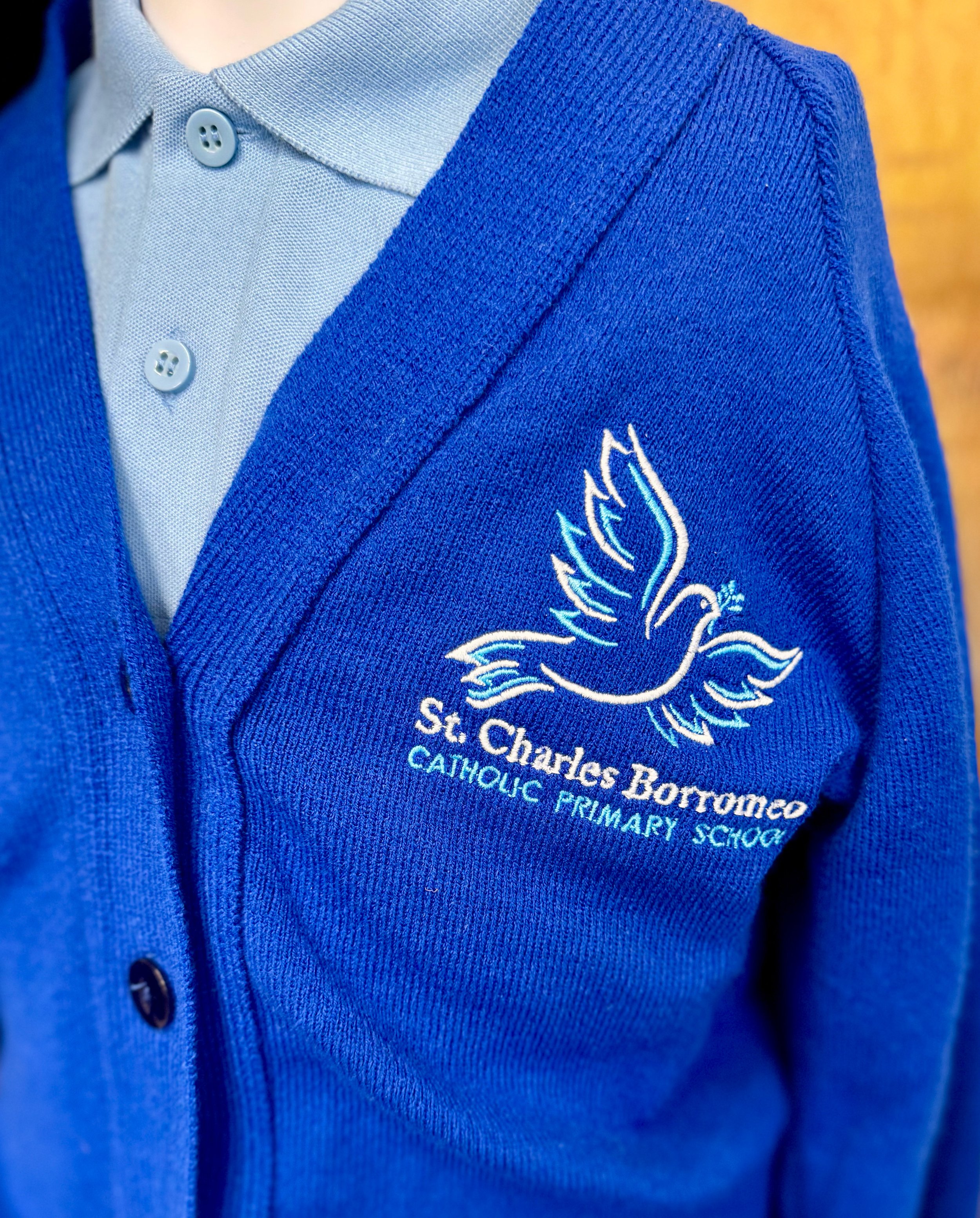
St Charles Borromeo Catholic Primary School and Nursery is a warm, community-focused school that values kindness, creativity, and connection. When Mr. Holt, the headmaster, first approached me, the school was using several versions of its dove logo across different materials and needed a more unified and professional identity.
The Brief
The project began with the design of a single banner. However, it quickly became clear that the school needed a consistent, thoughtful identity to bring together its visual presence and reflect its welcoming values.
The Solution
I designed a new dove symbol that feels both friendly and professional, perfectly balancing warmth with clarity. The refreshed identity extended across uniforms, sports kits, printed materials, stationery, book bags, Word templates, PowerPoint decks, and new entrance signage, giving the school a cohesive and confident visual voice.
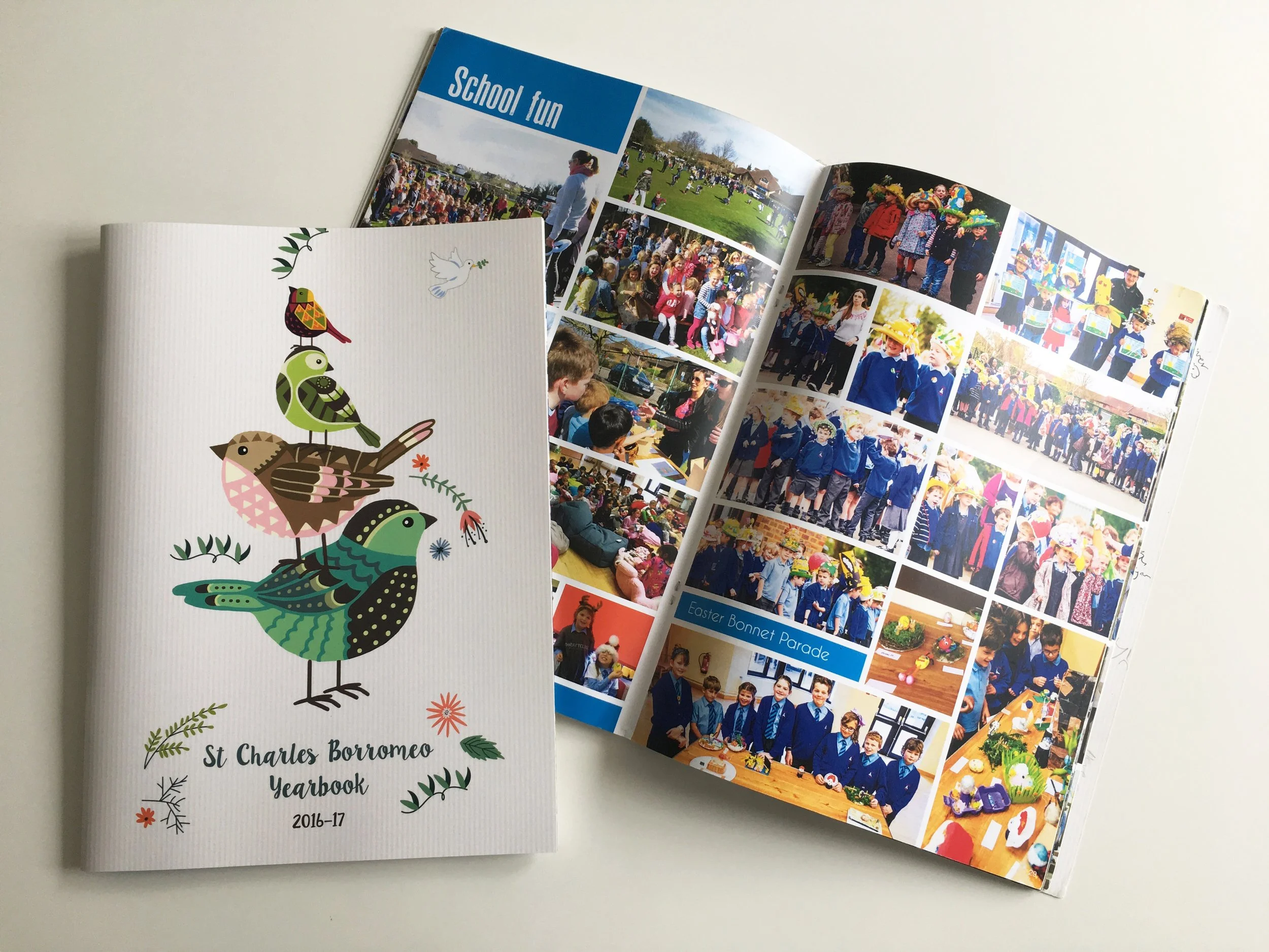
In addition, I designed the school’s annual yearbook for three consecutive years, each with a completely new creative concept that captured the energy and spirit of that school year.
Outcome
What began as a single design request evolved into a full brand transformation. The new identity has been warmly embraced by staff, students, and parents alike, giving St Charles Borromeo a consistent and welcoming image that truly represents its community.